 oonjung Jang
UX/UI DESIGN · Experiment
Designing a Clearer Autonomous Ride
My Role
User research
User Testing
UI Design
Timeline
2023. Sept - 2024. Jan
(6 months)
Skills
User Research
Product Design
Eye-tracking analysis
Outcome
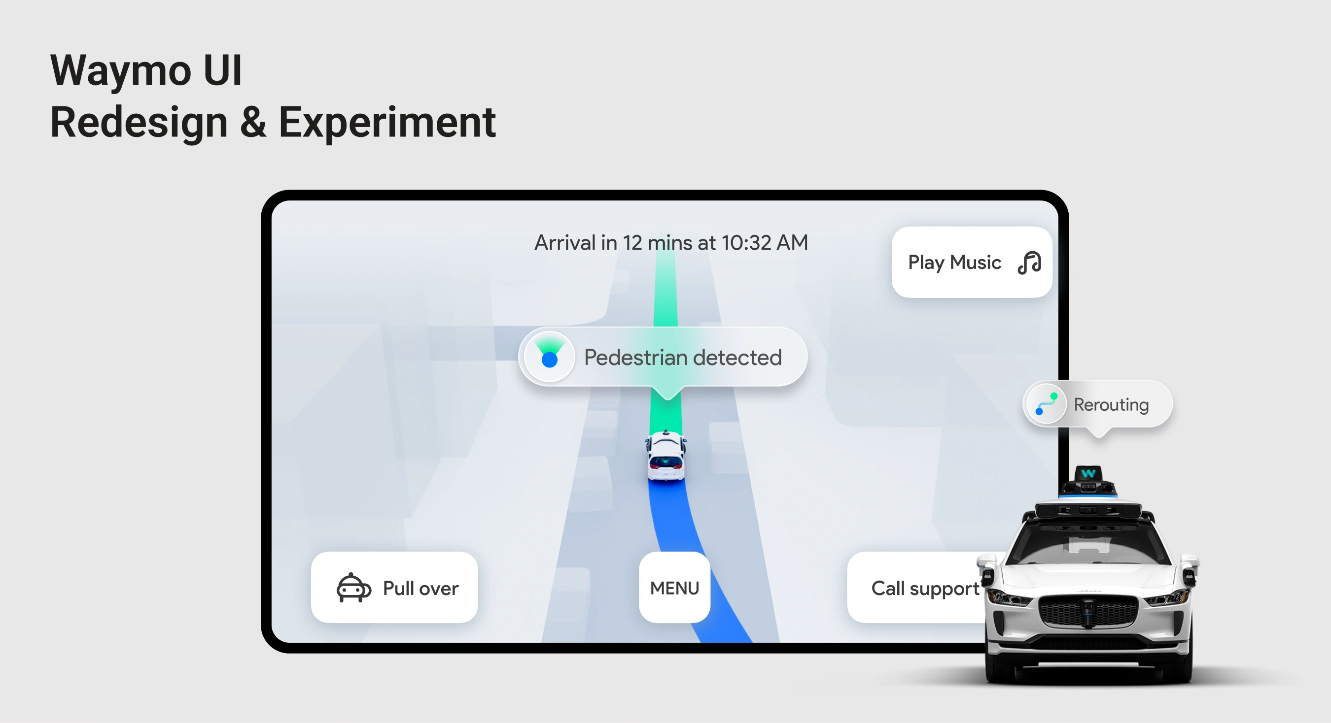
Redesigned passenger UI
Prototype for eye-tracking experiments
OVERVIEW
This project begins with an eye-tracking–based experiment examining how users visually perceive and interpret the Waymo in-vehicle display GUI, with a focus on attention distribution, information salience, and moments of visual breakdown during autonomous driving scenarios.
PROBLEM
Is the in-vehicle information adequate for passengers in autonomous driving situations?
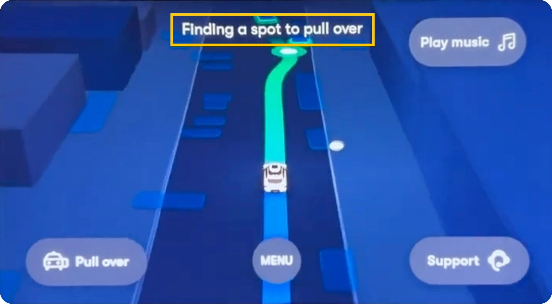
Upper-screen text display
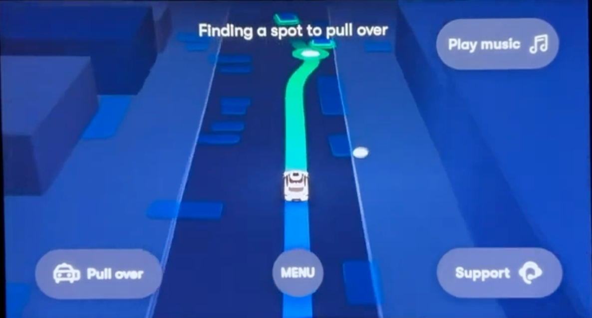
In Waymo’s UI, the reason behind the autonomous system’s actions is presented as text at the top of the screen.
SOLUTION
Making autonomous driving actions easier to understand
UI Structure
- Less confusion, faster sense-making
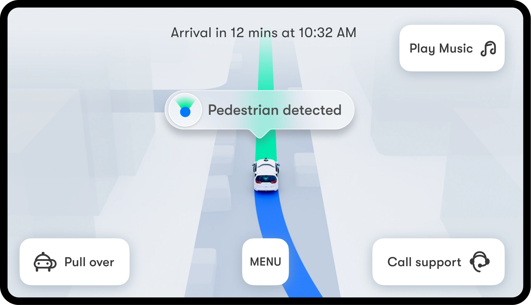
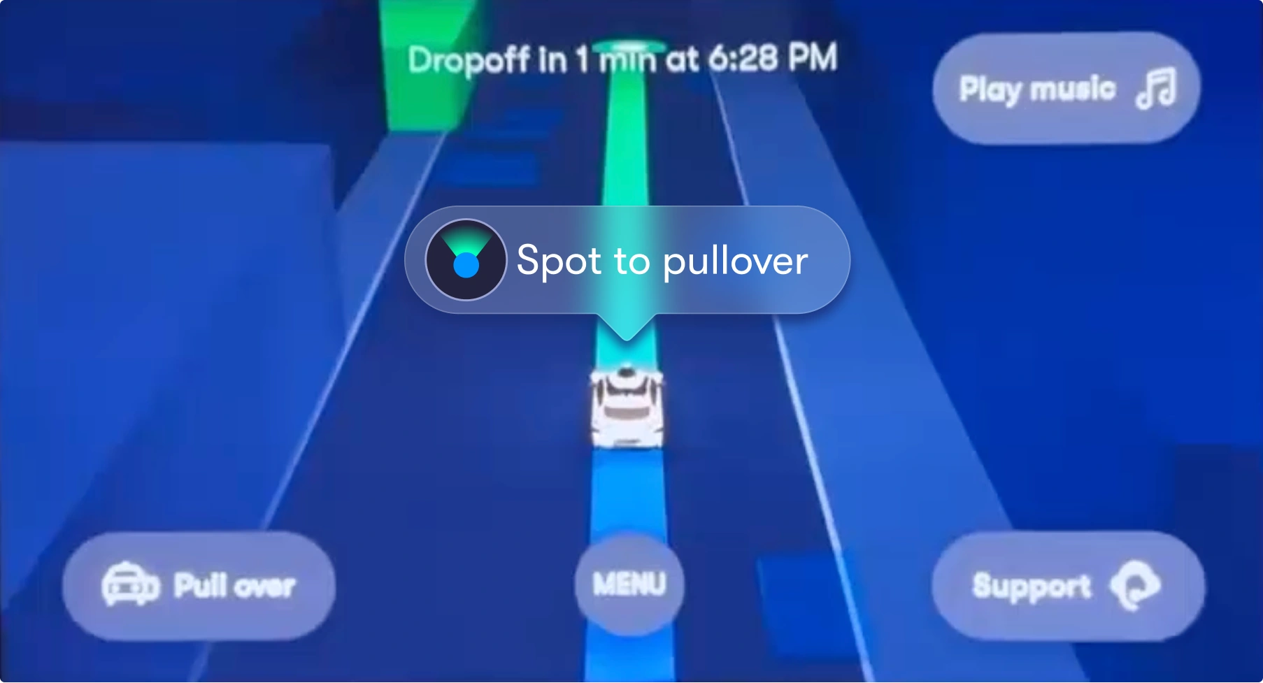
- Display a speech bubble directly above the vehicle icon
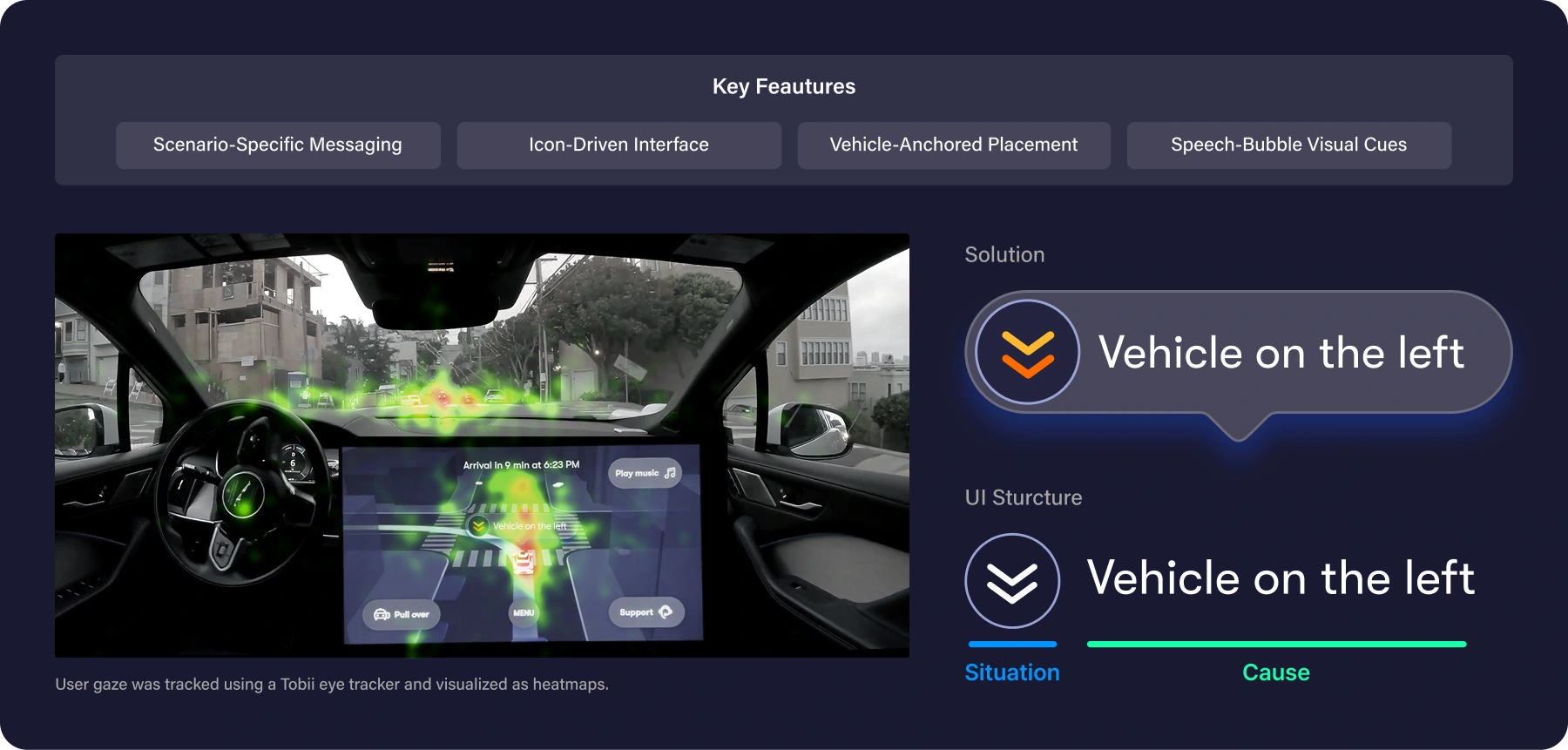
Heatmap analysis showed that passengers’ attention was concentrated around the vehicle icon, so action-related information is displayed directly above it in a speech bubble to reinforce its connection to the vehicle, with a subtle shadow improving visibility and visual separation.
Pilot Test
Eye-Tracking Experiment for UI Comparison and Evaluation
Generated improvement ideas and ran a pilot test to validate eye-tracking
Evaluating Passenger Anxiety Based on Interface Feedback in Autonomous Driving Emergencies
Team A
Video Viewing
Eye Tracking
AS-IS
Post-Questionnaire
Team B
Video Viewing
Eye Tracking
TO-BE
Post-Questionnaire

Comparison of Anxiety Metrics
Fixation Duration
Quantitative Survey Results
Final Insights
The improved interface reduced passenger anxiety during sudden autonomous driving events, such as emergency braking, as indicated by shorter eye-tracking fixation durations.
Hwang, S., Kim, N., & Lee, D. (2023). A study on passenger anxiety evaluation in adverse weather conditions for autonomous driving from the user perspective. Journal of the Korean Society of Transportation, 41(1), 104–118.104-118.
https://doi.org/10.7470/jkst.2023.41.1.104

AS-IS
Video viewing & Eye-tracking
Post-survey
Comparison of anxiety indicators by TOI
fixation duration by video scenario
Conclusion drawing

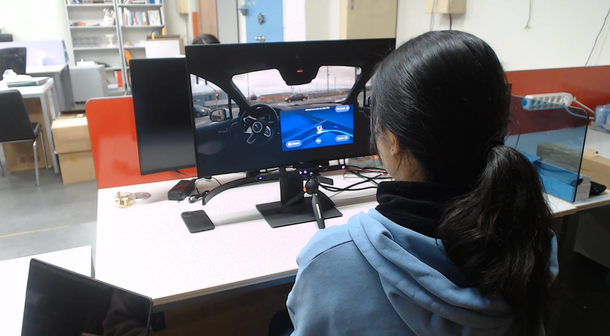
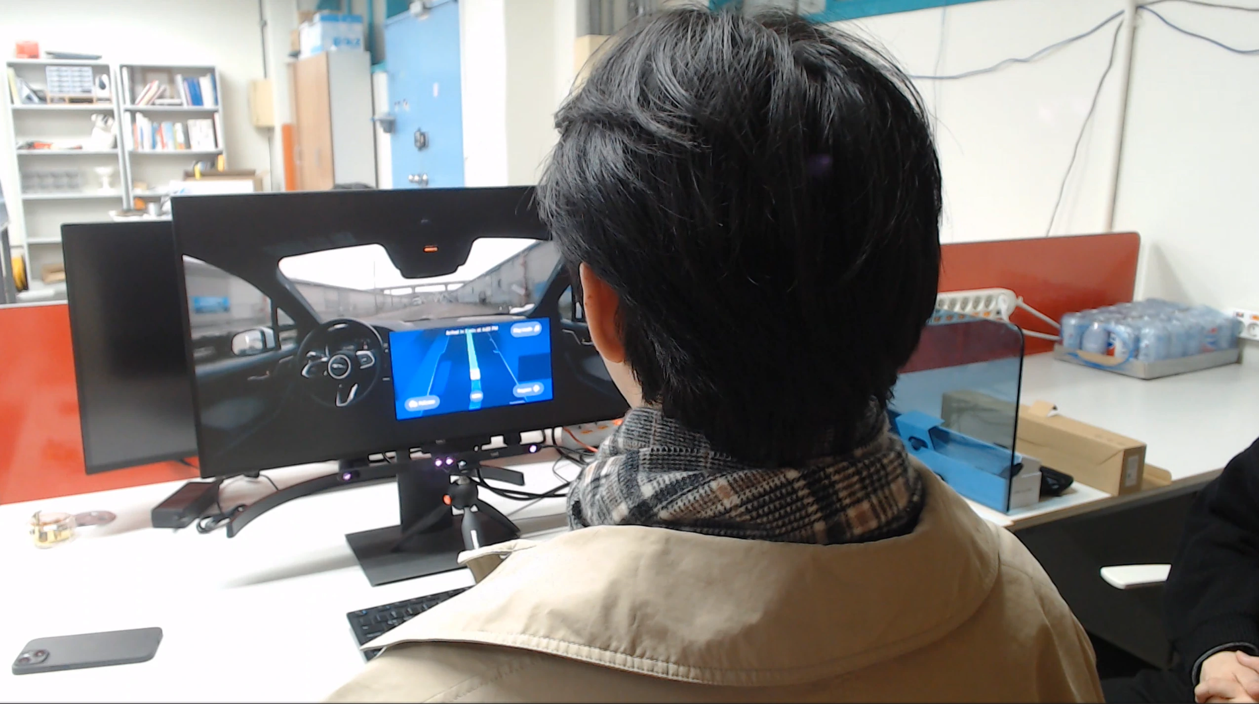
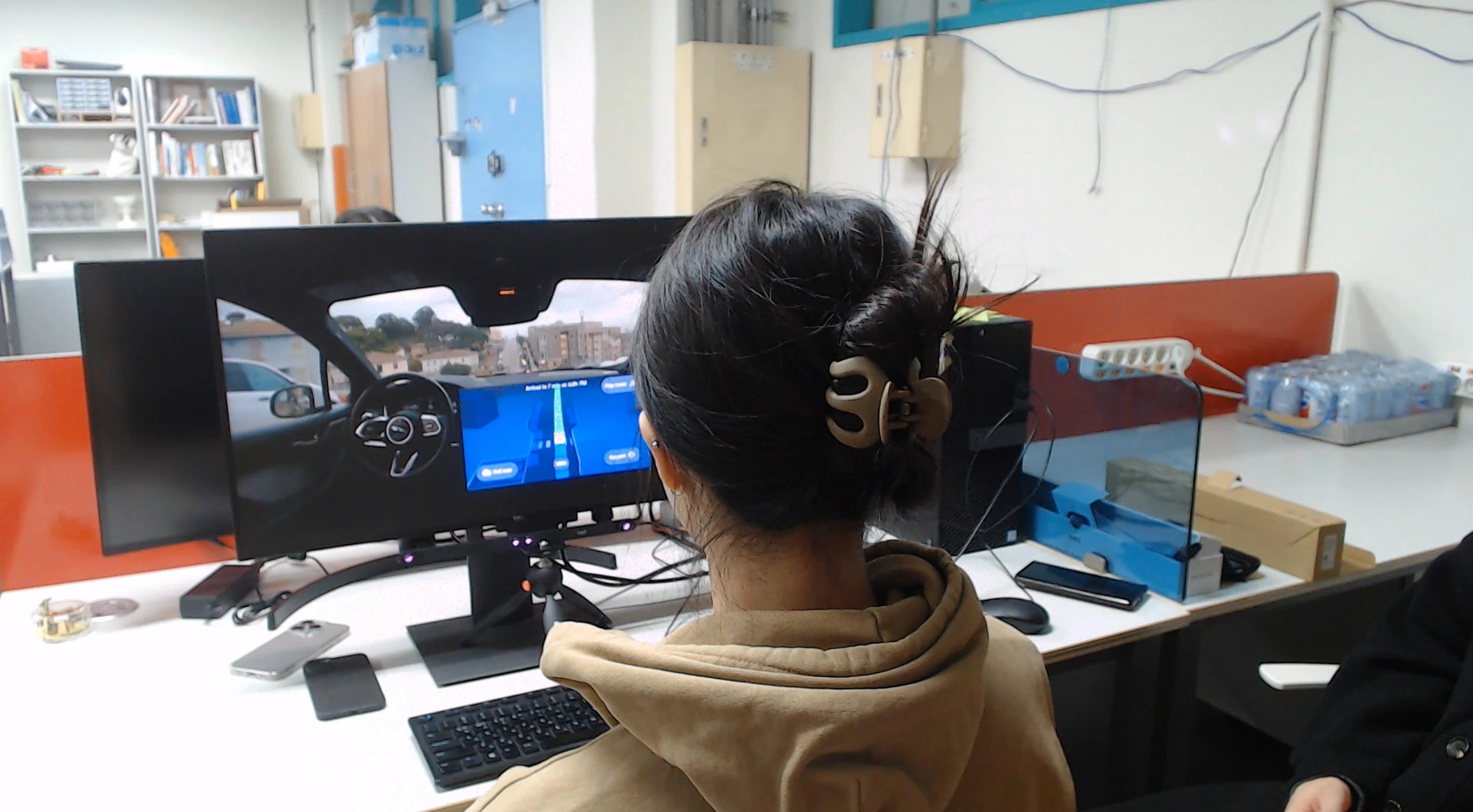
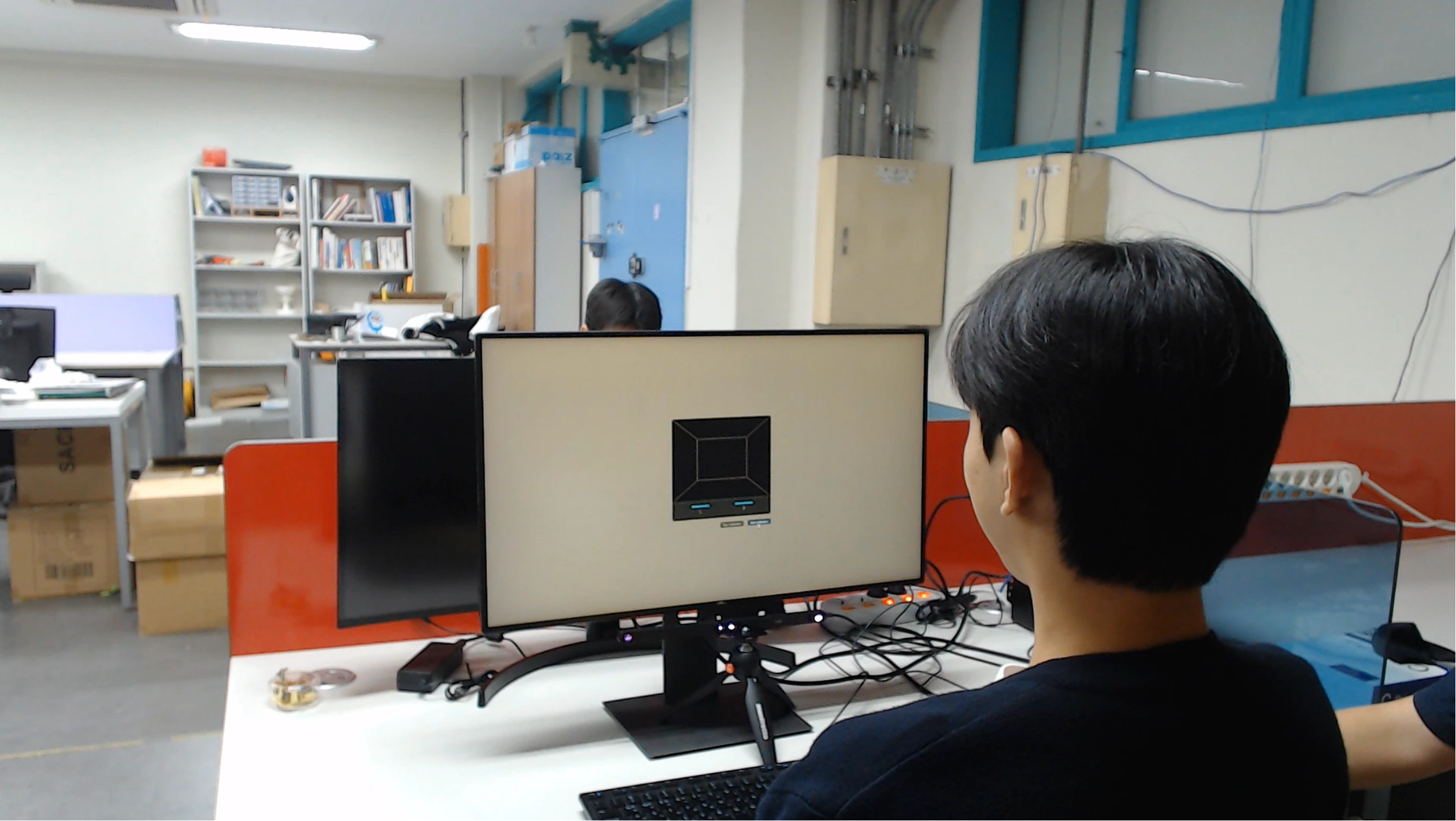
Collected gaze data via Tobii during autonomous taxi video viewing and analyzed gaze patterns with post-surveys.

Conducted an experiment with five male and female participants aged 20–40, encouraging open discussion with a moderator acting as a co-passenger.
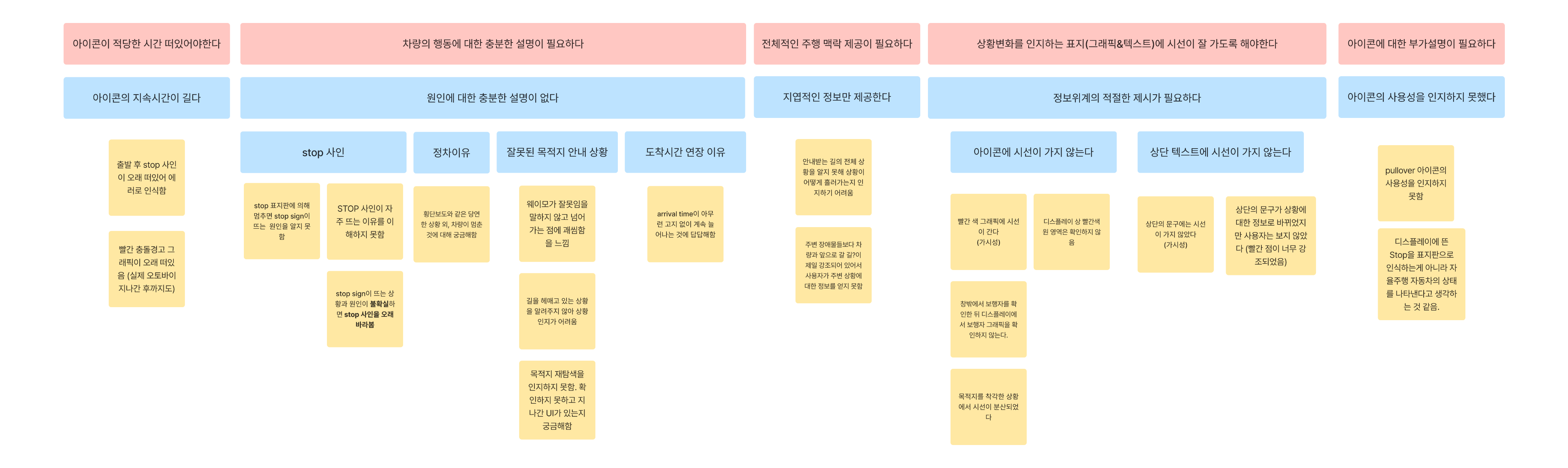
Qualitative feedback from participants was analyzed using affinity mapping.
01
Limited contexts for
information delivery

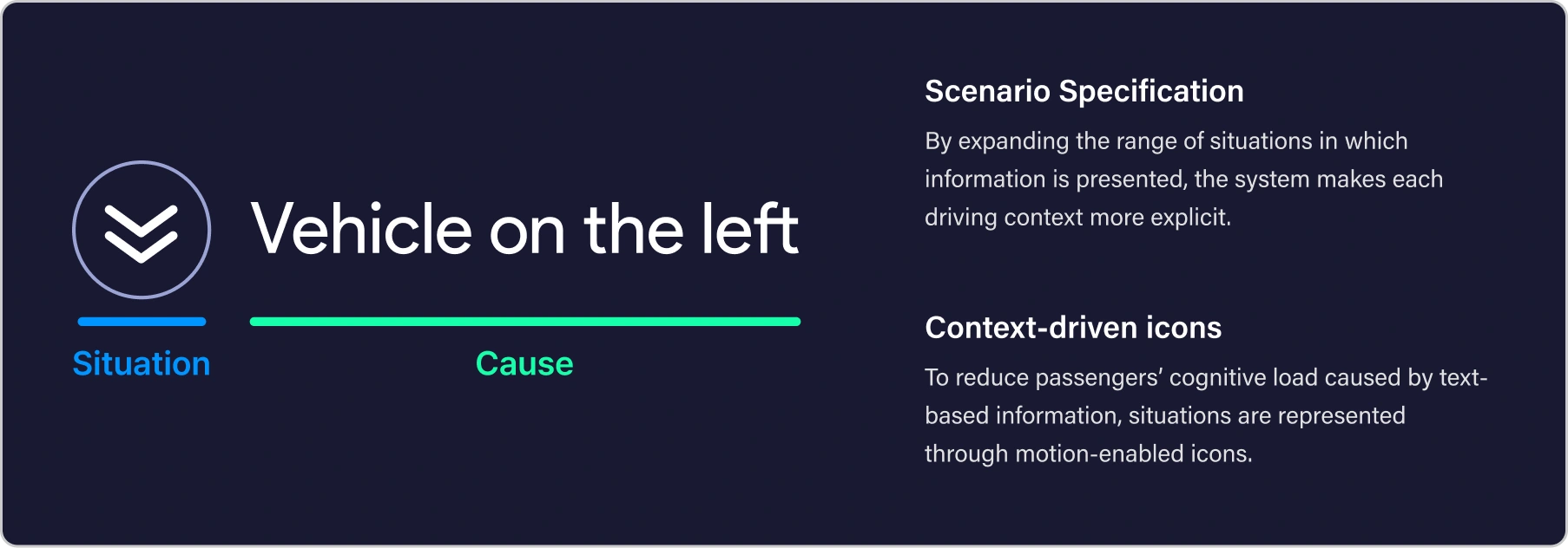
Various detailed situations are visually communicated using custom icons.
02
Information delivery
location and format

The information is conveyed via a speech bubble positioned just above the vehicle icon.
Problem
Solution
FROM INSIGHTS TO DESIGN
Solutions Informed by Pilot Testing
Generated improvement ideas and ran a pilot test to validate eye-tracking
FROM INSIGHTS TO DESIGN
Problem Definition Based on Pilot Testing
01
Limited Context of Information Delivery
When the autonomous vehicle appeared to lose its way, no explanatory information was provided, and participants reported increased anxiety.
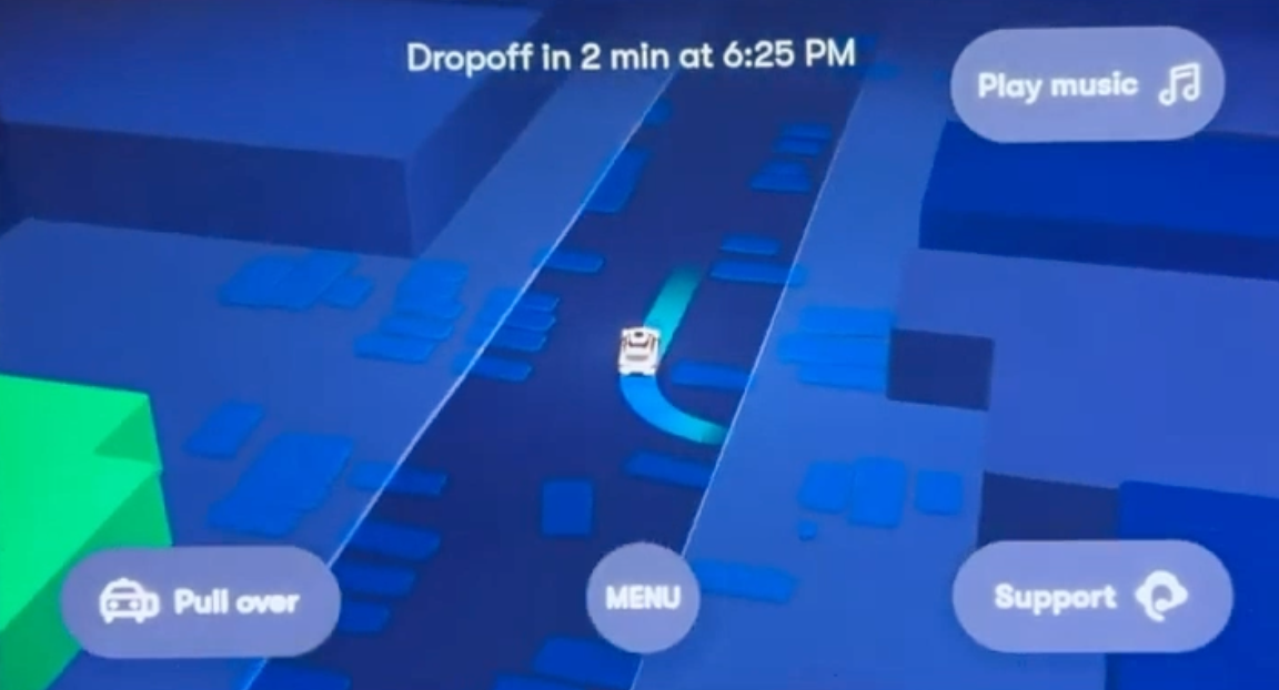
[Scenario 1: Route Confusion]
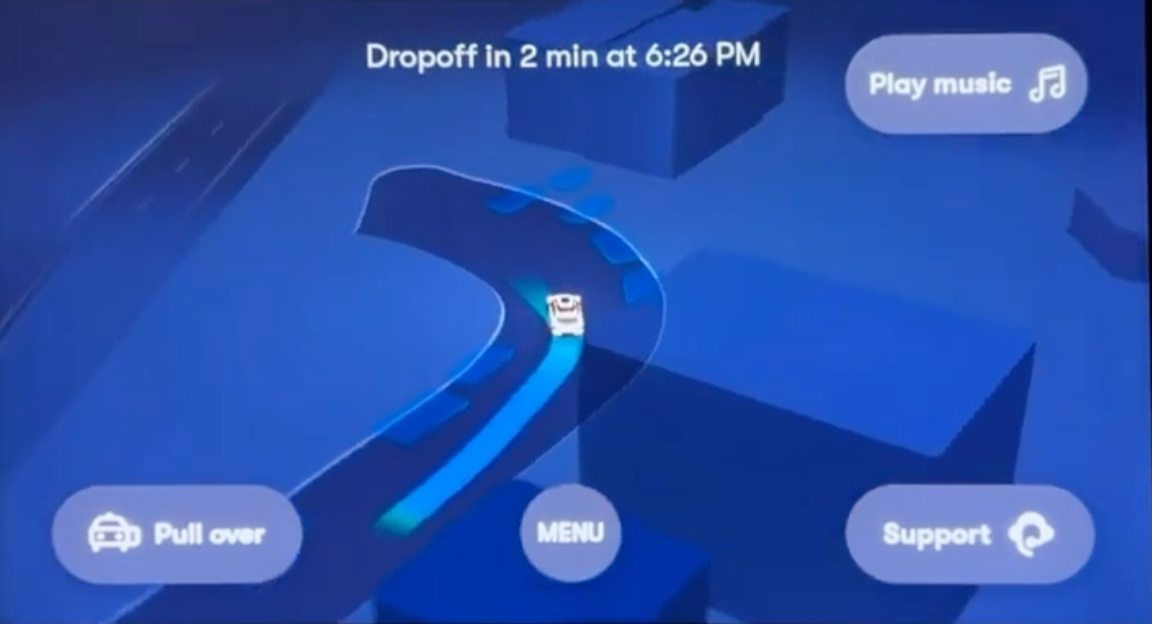
[Scenario 2: Route Confusion]
02
Inadequate Information Placement and Format
When an emergency braking event occurred, action rationale text displayed at the top of the screen received no visual attention from any of the five participants.
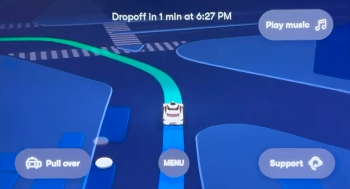
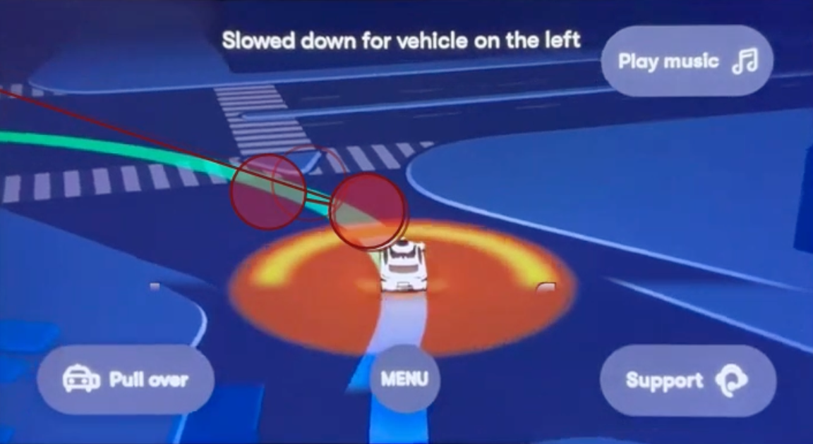
[No Visual Attention to Top-Aligned Text]
RESULTS | Prompt UI
Making the Vehicle’s Actions Clear
Short messages and visual cues explain what the vehicle is doing and why
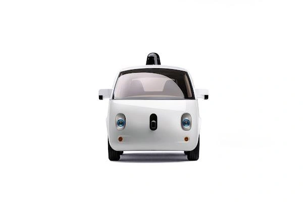
Speech bubbles above the vehicle icon connect each update to the vehicle, with light and dark modes for different lighting conditions.
Prompt UI : Light mode


Light mode
Rerouting


Rerouting
Person ahead

Person ahead
Pedestrian detected


Pedestrian detected
Busy intersection

Busy intersection
Prompt UI : Dark mode


Dark mode
Rerouting

Rerouting
Pedestrian detected


Pedestrian detected
Vehicle on the left
Vehicle on the left
Spot to pull over

Spot to pullover
Eye-tracking Test
“ Deriving ideas for improvements and conduct pilot tests to determine the effectiveness of eye tracking experiments.”
AS-IS
Upper-screen / Text
The autonomous driving system explains its actions through text placed at the top of the interface, making it difficult for passengers to access critical information in moments of uncertainty.
TO-BE
Center Screen / Prompt
The system’s action prompts are displayed as speech-bubble–style cues above the vehicle icon, enabling passengers to quickly access relevant information even in stressful situations.
LESSON I LEARNED
Learning how people process information under urgency

Understanding attention under urgency
Through the eye-tracking experiment, I learned that in urgent situations, users tend to return their gaze to the main visual anchor they have already been following, such as the vehicle image or icon. This insight showed me that critical information is more effective when placed near that anchor rather than elsewhere on the interface.

Looking beyond verbal feedback
This project taught me that what users say in interviews does not always match how they instinctively behave visually. By comparing interview responses with eye-tracking data, I was able to better understand the value of combining self-reported feedback with behavioral evidence.